INTRODUCING THE HOLTHINRICHS ELEGANCE ORNAMENT LIMITED EDITIONS FOR THE RAKE & REVOLUTION
Michiel Holthinrichs first amazed us with his 3D-printed Ornament watch; this year the Amsterdam-based watchmaker continues to impress by collaborating with Revolution and The Rake on two sublimely elegant limited editions.
Share:
One of my favourite discoveries of 2020 has been Holthinrichs Watches. Michiel Holthinrichs who is based in Delft, a town about 50km from Amsterdam, has created precisely the type of watch that I feel the collector community was searching desperately for. Why? Well, first he created an all-new design that is simultaneously different and intriguing but somehow familiar and comforting.
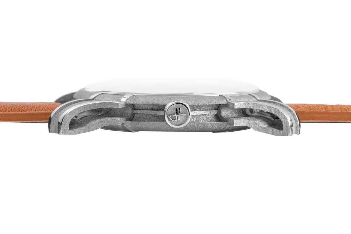
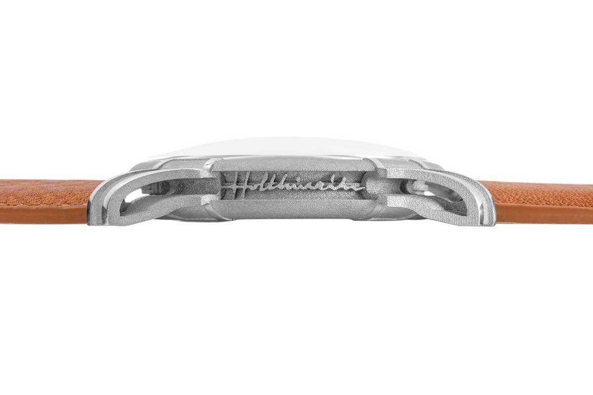
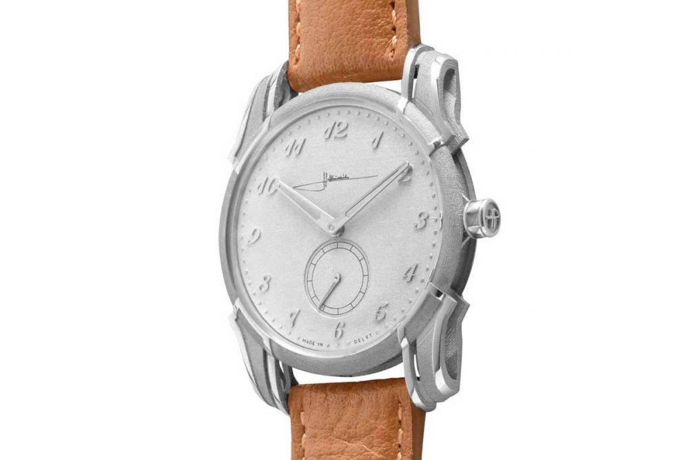
Part of what makes his perfectly sized 38mm case so unique is his use of 3D printing, which allows a remarkable level of complexity, particularly in the amazing massive architectural voids he creates along the caseband and through his signature lugs which are skeletonised along two axes and are to me reminiscent of the flying buttresses of France’s iconic Nantes Cathedral. I think it will come as no surprise that Michiel was an architect in a previous life. If there was a prize for sexiest modern watch lugs, I would be engraving Michiel’s name on the trophy.
Michiel Holthinrichs, The gentleman behind the watchmaking gem based in the Netherlands, Holthinrichs (Photo by Marcel Krijger Fotografie
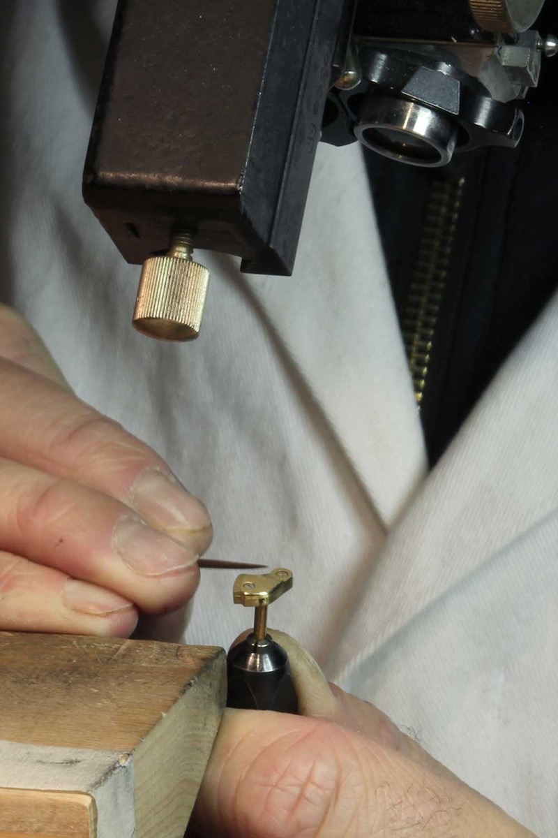
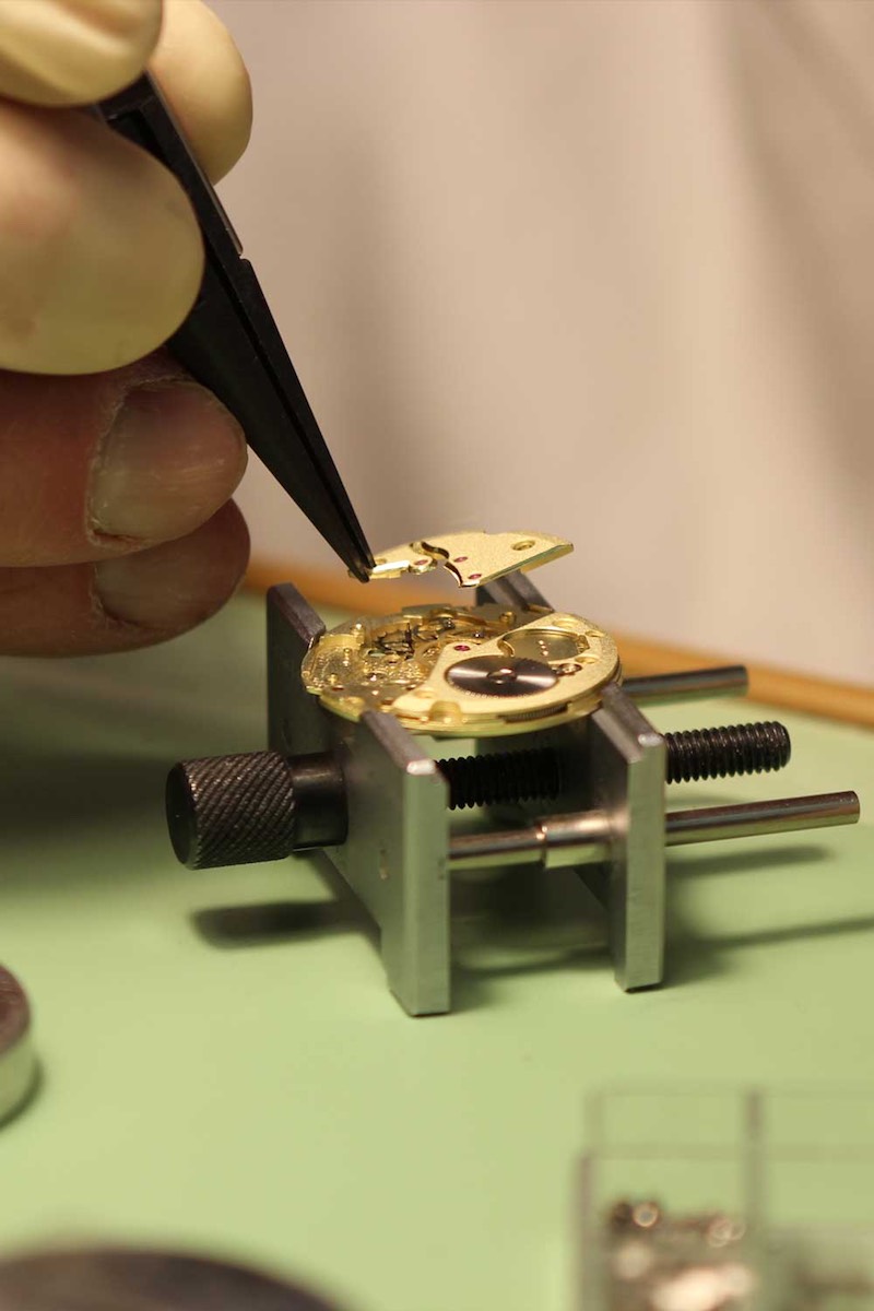
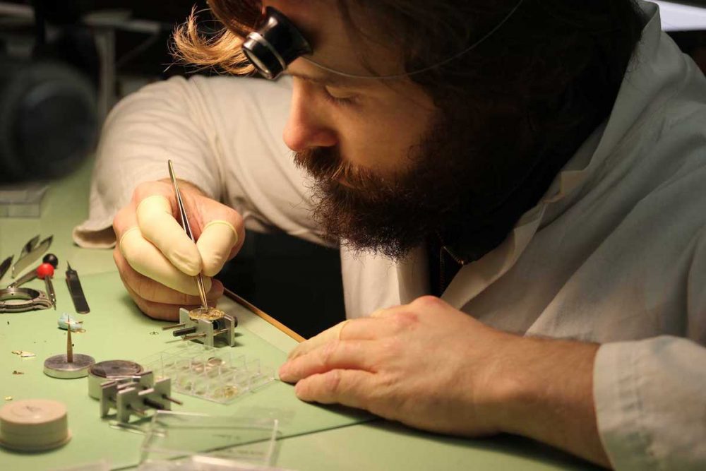
The second thing I love about Holthinrichs is that each and every watch is made by him, meaning he applies the angling to the handmade hands, he is the one applying the angles and the engraving to the baseplates and bridges of every one of his highly modified vintage Peseux movements.
In a world where automation even in the rarefied field of horology rules the day, it is refreshingly human to have the hand of the man whose name is on the dial actually finish and assemble every timepiece that leaves his workshop. The closest equivalent I can think of is the ultra-cool Akira Nakai of Rough World aka Rauh-Welt Begriff, the famed Japanese Porsche customiser who insists to fit each and every car with his signature fender flares, nose and speed tail personally. There are amazing videos of him travelling the world and taking his air saw to freshly painted Porsche fenders as he cuts them to make way for his magnificently bombastic wheel arches. Does this create scale issues for old-school craftsmen like Holthinrichs and Nakai? Of course it does.
Michiel Holthinrichs at his bench, assembling a highly modified NOS Peseux 7001destined for one of his timepieces
As demand for Michiel’s watches surges, he is already having trouble keeping up with all the orders. But he likes it like that. Amusingly, when I spoke to him last he told me he was “buried in fulfilling the orders for this year, but super happy and loving my work.” But such is the nature of handcraftsmanship and I feel that the wait for the Holthinrichs watch is part of the experience. I particularly love that he militates against other critically acclaimed brands that are essentially clever designs with totally outsourced manufacturing.
Finally, what I love best about Michiel is his honesty. Considering the buzz around him as one of the hottest independent horological commodities, he could probably charge twice to three times as much for his watches. But he doesn’t. He explains, “Sure, I’ve received offers for more to even skip the line for my watches but that’s just not the type of person I am or the type of brand I want to have. We are very down-to-earth people in Delft. I want my customers to feel that they receive a real value in the watch that I’ve created for them. I think that especially today there is a real search for authenticity and I hope my watches represent that.”
Holthinrichs × Revolution and The Rake
Considering the not-insubstantial demand for his watches then, I was surprised and touched that he reached out to propose a collaboration on a small series of handmade watches after I wrote an article on him previously. Little did I know too, that The Rake had been essential in building his initial interest in watches. Michiel confides, “I learned about ultimate classic style through The Rake, and becoming interested in clothing and style, this inevitably led me to watches.”
Read Wei Koh’s initial interview with Michiel, here.
The idea that Michiel had was intriguing. He explained, “I am a fan of both your magazines — Revolution which is one of the best and coolest watch magazines and websites around, and also The Rake which is really a unique voice for classic elegance. Why don’t we create a different design for each of these, one for Revolution and one for The Rake?” Without hesitation I immediately agreed and so we assembled a black ops team consisting of Ross Povey, my UK editor-in-chief, and Sumit Nag, my head of online, and began to discuss the concepts.
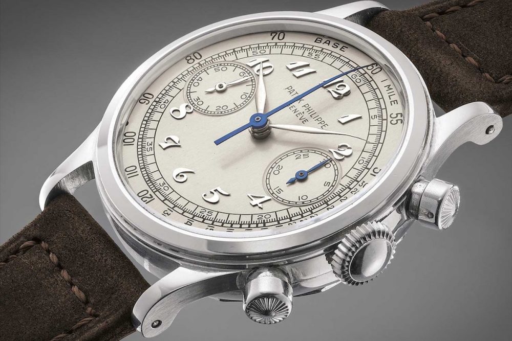
We decided immediately to identify one signature shared design trait that could be carried across both the Revolution and Rake model watches. As I had been buried in my massive story about Patek Philippe’s vintage chronographs, specifically the reference 130 and the reference 1463, I had been poring over images of these watches. Time and again I had remarked to Ross and Sumit about the near-hallucinatory beauty of the rare Breguet-numeral-dial versions of these watches. And so almost immediately Ross proposed, “Why don’t we use Breguet numerals?” I was sold.
1950 Patek Philippe chronograph ref. 1463 in steel with Breguet numerals (Image: phillipswatches.com)
“I love it,” was Michiel’s reply. And like that he was off on his design process. Holthinrichs features two very different case finishes for his Ornament model case. The traditional finish is smooth-polished and sublimely elegant. But he also offers what he calls the RAW Ornament, which features a case surface that looks like it was roughhewn out of granite with a chisel and a hammer while drinking whiskey straight out the bottle. It looks like an even more brutal version of the sandcast magnesium parts found in old Formula 1 cars and super bikes. And these two finishes gave Michiel the idea for distinguishing the two watches. He explained, “For Revolution which brought a ‘cool’ attitude to watch journalism, I want to make a watch that is inspired by Brutal Elegance. We will use the RAW Ornament case as the foundation for this. But for The Rake which is about style, I want to make a watch that epitomises Refined Elegance. The type of watch a boulevardier or flaneur would wear.” We loved the idea.
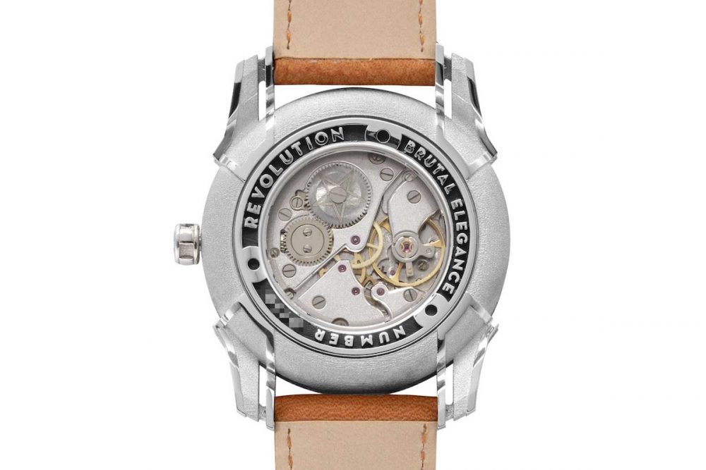
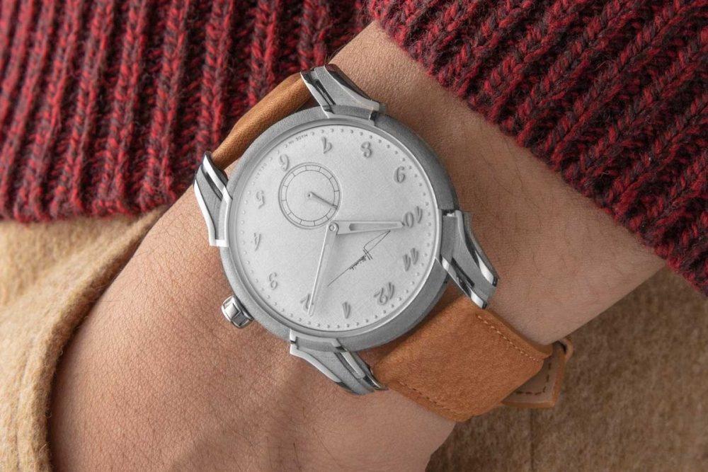
Brutal Elegance Ornament Limited Edition Holthinrichs Brutal Elegance Ornament for Revolution is a 10 piece limited edition with a sandblasted-type finish dial contrasted by high-polished angular applied Breguet numerals (Revolution) A closer look at the sandblasted-type finish dial contrasted by high-polished angular applied Breguet numerals on the Holthinrichs Brutal Elegance Ornament for Revolution (Revolution)
The watches that Michiel designed are as follows. For Revolution he created the B.E.O or Brutal Elegance Ornament. This features a 38mm steel case in his signature raw finish which looks like a sandblasted treatment but is actually the way the metal emerges from the 3D-printing process.
The benefit to this is significant because although sandblasting creates a robust-looking finish, it is actually extremely delicate and scratches very easily. Conversely, the raw finish from Michiel’s 3D printing is relatively resistant to scratching. It is also uniquely identifiable as he is the only individual in watchmaking that uses this technique for his cases. As such, his “raw” look acts as a visual identifier for his brand.
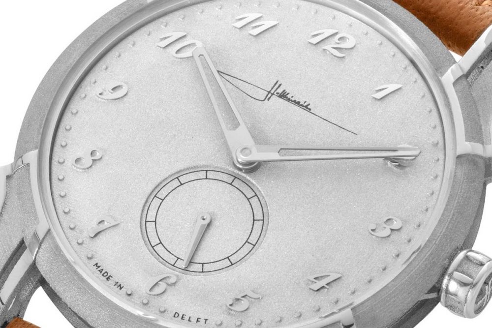
The beauty of the raw finish is sublimely contrasted by the high polishing applied to areas such as the lugs and the crown. This is a hugely labour-intensive process. Michiel laughs, “I have to finish each of these cases with a small file and sandpaper to achieve the level of refinement I feel is necessary.” To keep the brutal theme going, Michiel selected a dial with a similar brutal sandblasted-type finish. But this is contrasted by stunning high-polished applied Breguet numerals. Says Michiel, “If you look closely you will see these numerals have sharp straight edges to keep a maximum of dramatic contrast with the dial. This idea of dynamic tension between roughness and refinement is something I learned from architecture and perhaps most from Le Corbusier.”
Holthinrichs' skeletonized lugs are unlike anything seen in the world of watchmaking (Revolution) The NOS Peseux 7001 movement used for the Holthinrichs Brutal Elegance Ornament for Revolution features the same sandblasted-type finish on its bridges as on the dial (Revolution) The Holthinrichs Brutal Elegance Ornament for Revolution on the wrist (Revolution)
For the Brutal Elegance Ornament, Michiel worked on different minute tracks including applied markers but finally arrived at a technique that looks like dots fixed to the dial but actually aren’t. He explains, “Because my dials are also 3D printed, I could specify to have these dots for the minutes that stand out in relief from [the] dial but they are actually part of the printing process.” The result is a watch that expresses a sense of refined brutality that Michiel complemented with a rough and heavy buffalo strap.
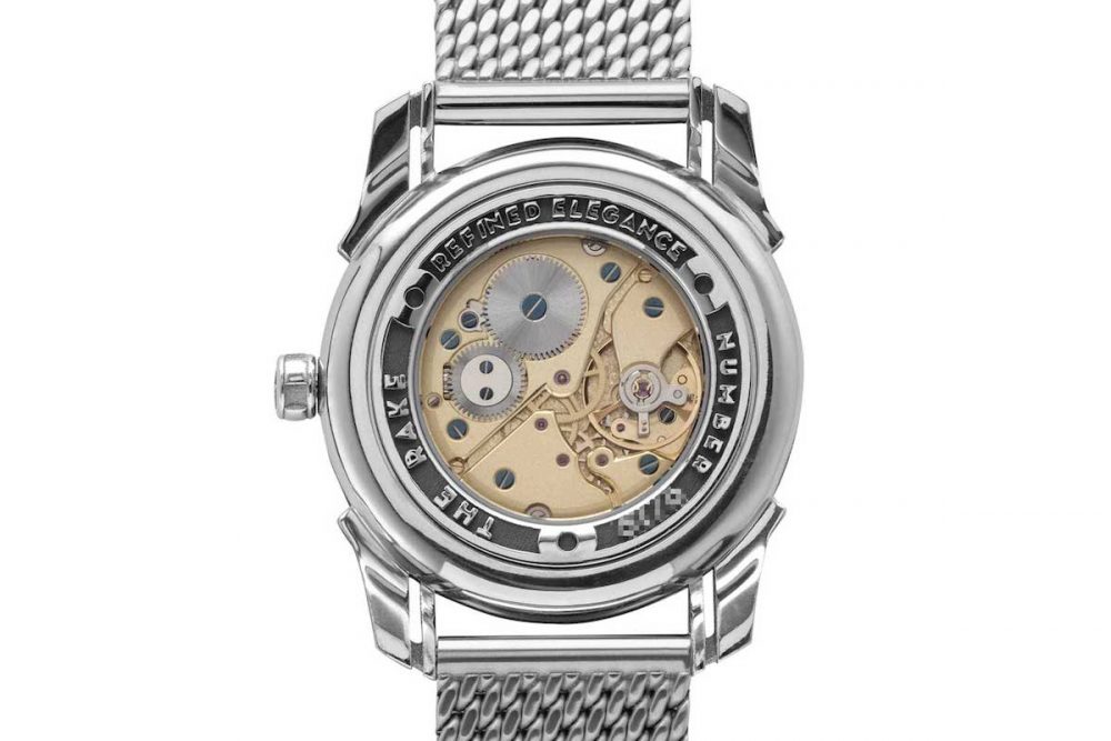
For the movement, he wanted to keep the sandblasted effect and used a stunning frosted finish to the white rhodium-treated mainplate and bridges. The evidence of laborious hand work is on full display here. Says Michiel, “All the edges of the bridges are bevelled and polished by me with sharp inward and outward angles that collectors will recognise as signs of real handmade anglage. There’s no milling machine that is capable of creating these sharp inward angles. Similarly, all the screw heads are black polished by hand to achieve a mirror-like surface that doesn’t reflect light.” Michiel’s slavish devotion to detail doesn’t end with the movement. He cuts every one of his own watch hands from extra-hard, rust-resistant spring steel and then bevels and polishes them by hand. He says, “I feel that even if you don’t tell the owner about how much hand work goes into his watch, he senses it unconsciously and it resonates with him.”
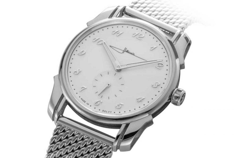
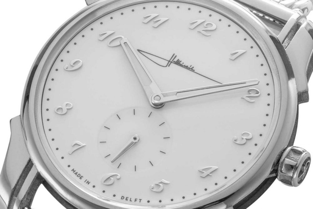
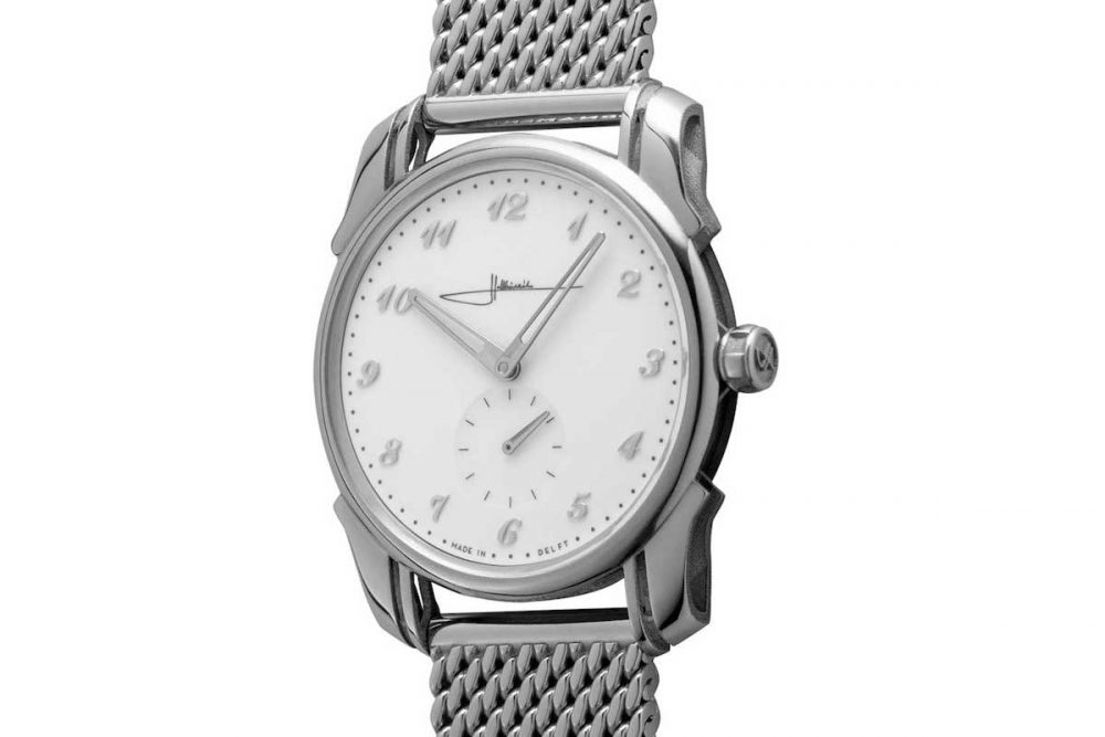
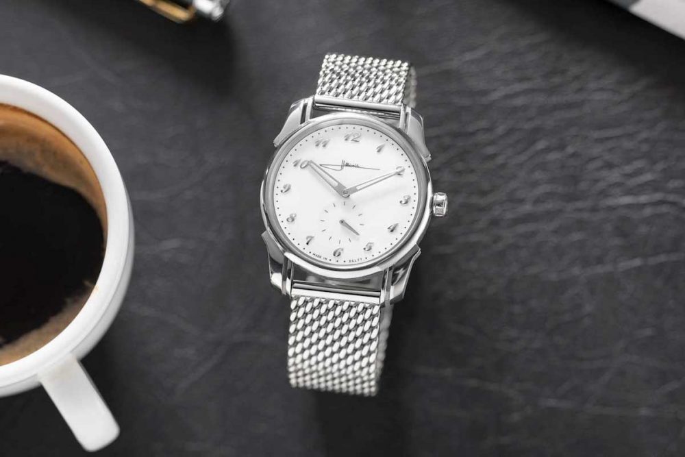
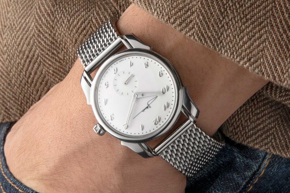
Refined Elegance Ornament Limited Edition Hoithinrichs Refined Elegance Ornament Limited Edition for The Rake is a 10 piece limited edition with a white stretched lacquer dial contrasted by high-polished rounded applied Breguet numerals (Revolution) A closer look at the white stretched lacquer dial contrasted by high-polished rounded applied Breguet numerals on the Holthinrichs Refined Elegance Ornament Limited Edition for The Rake Revolution)
For The Rake’s R.E.O or Refined Elegance Ornament, Michiel began with his high-polished 38mm Ornament steel case. He explains, “Immediately when I thought of a dandy’s watch, I thought of a grand feu enamel dial. But this would immediately shift our target price of USD 6,500 up dramatically. So I ended up using the Japanese lacquer that I have experience with from my Blue Delft Limited Edition.” This material, also called “stretched lacquer”, is applied in layers and when it is finished, comes remarkably close to the look of grand feu enamel but without the fragility or super-high cost. Says Michiel, “Because I knew we were going to have to drill holes in the dial for the applied Breguet numerals, I thought this was the best course.” Michiel’s attention to detail came down to creating a slightly different type of Breguet numeral than he used on the Brutal Elegance dial. He explains, “Here I used numerals with a softer rounder profile which I feel complemented the lush, stunning high-gloss look of the Japanese lacquer dial better.”
For the minute indexes and his logo, Michiel selected a soft grey pad-printing technique which evokes faded indexes in vintage enamel. He explains, “Initially I tried black print but it came off too harsh. I wanted something more subtle and timeless-looking and after many experiments arrived at this grey.”
The Holthinrichs Refined Elegance Ornament Limited Edition for The Rake has brilliantly polished surfaces that contrast with the inner surfaces of the 3D printed case, which are of a sandblasted-type finish (Revolution) The Holthinrichs Refined Elegance Ornament Limited Edition for The Rake is fitted on a "beads of rice" bracelet reminiscent of vintage Gay Freres bracelets (Revolution) The NOS Peseux 7001 movement used for the Holthinrichs Refined Elegance Ornament Limited Edition for The Rake features a sandblasted-type finish on its bridges (Revolution) The Holthinrichs Refined Elegance Ornament Limited Edition for The Rake on the wrist (Revolution)
For the movement, by this point, Michiel and our team had grown so enamoured with the frosted finish applied to the Brutal Elegance Ornament that we wanted to continue with this finish for our Rake watch. Says Michiel, “There was of course the temptation to do a Côtes de Geneve and blued screws finish but there is something both charming and unusual about the frosted finish. A lot of watchmakers don’t like to use this because it shows every mark that’s made on the movement, but it is also reminiscent of the finish that was used in traditional British watchmaking in the 18th century. Since The Rake is based in London we thought this could be a fun nod to the magazine’s roots.” The takeaway from our collaboration with Holthinrichs is that he considers every detail of his watches over and over. He explains, “We also included a kind of hidden message in the caseband of the watch which is deeply recessed so it is subtle and something for the owner to discover. I love little touches like this.”
Finally, for the Refined Elegance watch, Michiel and I wanted to add another signature touch in the form of a “beads of rice” bracelet reminiscent of the vintage Gay Frères bracelet worn with a wide array of watches by renowned collectors such as Auro Montanari, also known by his pseudonym of John Goldberger. Says Michiel, “To me this kind of ‘beads of rice’ bracelet is the ultimate touch of style and elegance and so we had to add it to the watch. It took me a while to find a manufacture that made one with the quality I required, but I finally found a great company in Germany that made the perfect one.”
Priced at USD 6,500 and limited to 10 examples each, each watch takes up to six weeks to complete upon ordering, as they’re all handmade by Michiel himself. Additionally, if you want your name engraved on the back, you totally can.
How to Purchase
The Holthinrichs Brutal Elegance Ornament for Revolution is available to buy exclusively through Shop.Revolution.Watch
If you’re interested in the Holthinrichs Refined Elegance Ornament Limited Edition for The Rake, head over to TheRake.com