How to Master Colour Clashing
Colour clashing is novel territory for many, but it needn't be complex. All it takes is adherence to some basic ground rules and a sense of certitude.

For many men, the mere prospect of colour clashing is enough to induce panic. Straying from the safety of preconceived style notions is a daunting endeavour, and reasonably so seeing as fashion is so often predicated upon rules. Even the term itself – colour clashing – reeks of rebellion and dissent. It makes sense then, that the majority of men choose to stick to a tried and tested uniform of neutrals, some forsaking colour altogether. Yet as intimidating as it may seem, the practice of colour clashing is in fact far easier and more accessible than many would imagine. A small dose of daring goes a long way, and when combined with some careful consideration and basic aesthetic awareness, can transform the most colour fearing dresser into a colour-clashing connoisseur.
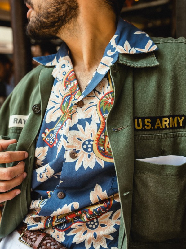
Of course, like any endeavour involving deviation from convention, colour clashing has the potential to go awry, and as much as we champion audaciousness, this particular trend must be approached with an element of caution, preferably under the guidance of those in the know. For such enlightenment, take heed of the impeccably dressed men who flocked to Pitti Uomo 94 in Florence a few weeks back. Colour clashing was ardently embraced and took on various guises, the summer heat and creative energy at the event responsible for provoking playful and unconventional approaches to styling that can be readily adopted by those seeking a wardrobe refresh.
Such sartorial discordance at Pitti was particularly interesting to observe, seeing as suiting so heavily dominated. The classicality of traditional tailoring was tastefully juxtaposed with unorthodox colour pairings, making for a novel and modern approach to formalwear that we’re bound to see much more of in the remaining summer months. The key to this styling manner is subtlety – as counterintuitive to the notion of colour clashing that may seem. Yet a little clash goes a long way, especially if you’re new to the whole shebang.


For a fuss-free yet impactful initiation, separates are your go. A classic checked jacket teamed with a pair of neutral-toned trousers, a striped shirt and – if you’re feeling bold – a patterned tie will set you off to a flying start. Look to tailoring brands like Rubinacci, Lardini and 100 Hands for quality-crafted pieces that you’ll wear time and again in various iterations.
Keep it even more straightforward by adding a single clashing element to your otherwise coordinated ensemble – think a neutral suit with contrasting shoes or perhaps a mismatched tie or socks. Never underestimate the power of accessories – even a striking pocket square in opposition of an incongruously coloured jacket would make a light-hearted addition to more conservative suiting. In this case, New & Lingwood, Calabrese 1924 and Rampley & Co are all fantastic options for polychromatic pieces that will enhance your outfit.


When considering your clash palette, it is important to decipher what colours work for you. Although there are no strict rules per se, we recommend keeping to a relatively limited range of contrasting colours and opting for supplementary shades outside of these. Avoid any potential for garishness by choosing a predominating colour as a base and working from there. Unless you’re a seasoned colour clasher or a second-grader, steer clear of primary colours. Neutrals and muted hues are much easier to style – think navy, brown, burnt orange, burgundy, mustard, deep green and khaki, which you can then experiment with in different variations. Integrating textures, layers and patterns will add extra punch, but keep it relatively simple and be wary of going overboard – trying too much at once will tip you over into eyesore territory.

Speaking of eyesores, you don’t have to be an expert in colour theory to identify what looks good, but familiarising yourself with the colour wheel may be of use if you’re seriously stumped and want to get a solid grasp on optimal combinations. Successful colour pairings can be complementary, that is opposite each other on the wheel – for instance violet and yellow, pink and green or blue and orange; analogous – colours beside each other on the wheel like red and pink; or triadic – three shades equally distanced, such as pink, green and orange. If this sounds all too much, don’t stress: your eye is naturally trained to pick up on what looks right (and to the same extent – what doesn’t). Acknowledge the validity of your own taste, trust any doubts that arise and have confidence in your sartorial decisions and personal style. After all, if there was anything trending at Pitti, it was conviction. There’s simply nothing more stylish – or rakish for that matter – than a man who fully believes in what he’s wearing.