The art of tonal dressing – matching garments of similar shades – is not as simple as it looks. Here’s how to get it right.
Share:
Used in a sartorial context, the word ‘sprezzatura’ – which was coined in 1528 by Italian Renaissance polymath Baldassarre Castiglione in The Book of the Courtier to describe “a certain nonchalance, so as to conceal all art” - is beset with paradox. Effortless elegance is evidently an attainable reality; affected nonchalance is clearly a contradiction in terms; the difference between the two is impossible to ascertain without the kind of mind-probe technology that, once invented, will only be utilised by government agencies and nefarious criminal masterminds.
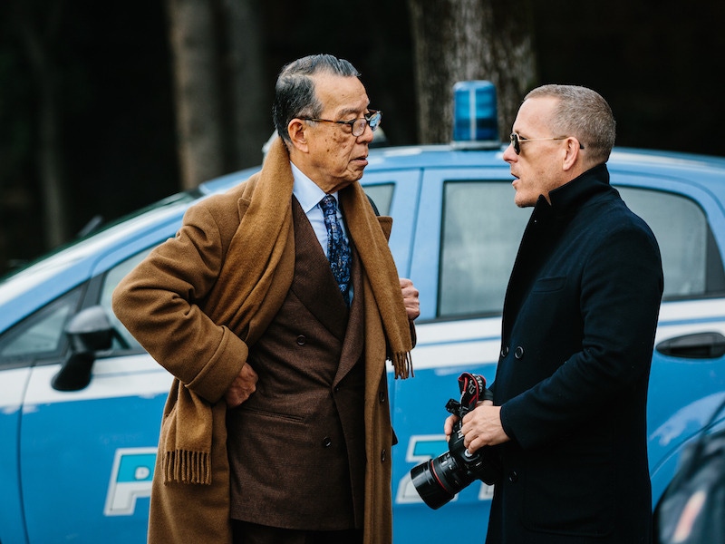
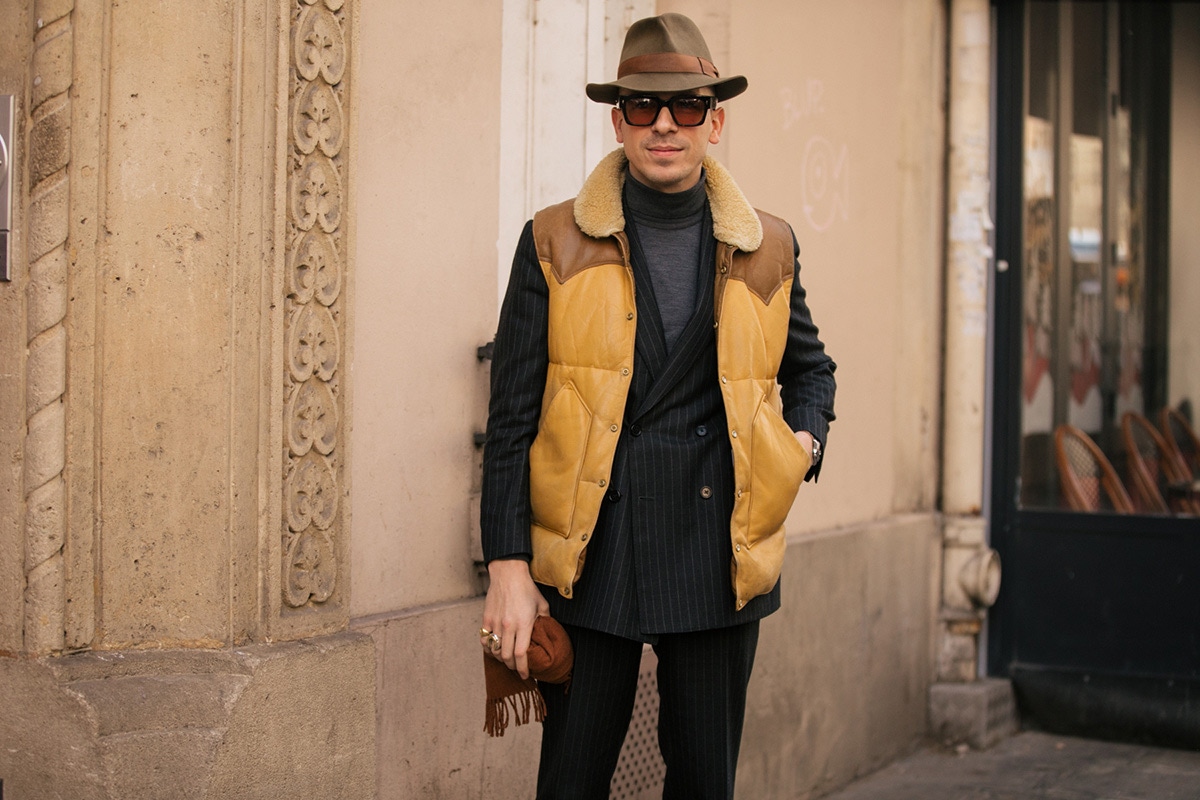
Certainly, those celebrated Pitti Peacocks – resplendent in their brassy alkecks, jaunty hats and pocket parachutes, rolled-up newspapers held aloft in the hope of catching the attention of passing street-style photog…. Sorry, taxi cabs, would hope to be judged on the right side of the line. But arguably, a vastly more profound, authentic nonchalance par excellence can arguably be achieved by ditching the imperious patterns, quirky affectations and bolder-than-thou juxtapositions of colour in favour of tonal dressing: matching garments of similar shade, such as pearl grey with charcoal or eggshell blue with navy.
“Tonal dressing has many advantages when handled correctly,” Joslyn Clarke, head of design at Grenfell, tells The Rake. “There are many classic examples such as military combat gear or the all black style often sported by the fashion cognoscenti.” Kit Blake founder and creative director Chris Modoo agrees. “When done well, tonal dressing is supremely elegant and can be quite formal,” he says. “A Marcella cotton bow tie with a starched collar is the classic combination in the gentleman's wardrobe, where we rely on shape and texture to create visual interest, and we can learn from this example for informal dressing too.”
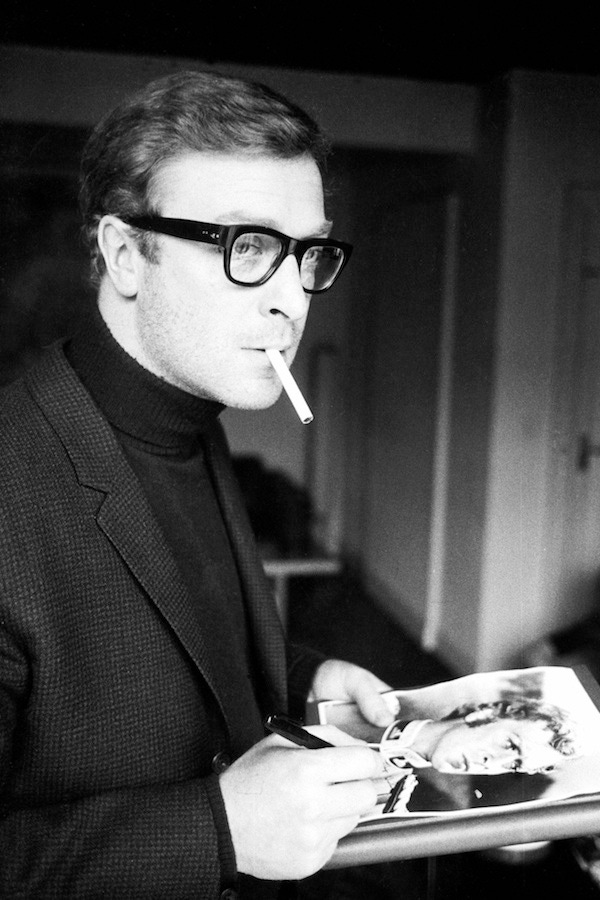
Luca Rubinacci, meanwhile, has an interesting theory about the advantages of tonal dressing in the higher echelons of corporate life. “Especially with darker colours, for many entrepreneurs – especially if they’re going to conduct meetings or do public speaking – tonal dressing is done on purpose in order to make people focus on what they’re saying, not what they’re wearing,” he says. “This is why, I believe, Steve Jobs dressed in black.”
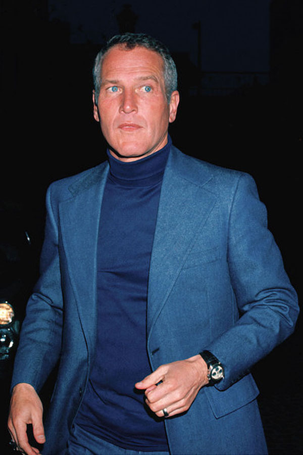
A slightly more flamboyant take on the corporate chic approach – one which sidesteps the media studies lecturer look perfected by Jobs – might be Ring Jacket's calm twist wool suit in navy draped upon Drake's raw indigo dyed denim cutaway collar shirt, with a Turnbull & Assernavy grenadine silk tie thrown into the mix should the occasion demand it: a look that also pays credence to Rubinacci’s philosophy when it comes to the subtleties of hue. “You have to wear similar tones – rather than, for example, very light blue with very dark blue,” he says. “They’ll clash because of the strong contrast. Similar tones such as beige and camel, dark blue and mid-blue, grey and taupe work.”
Whether opting for a formal or casual ensemble, all experts we consulted agreed that attention to texture is key. “The subtle gloss of pebble grey silk crepe de chine against grey cashmere is exquisite, even when the shades are the same,” Clarke points out, adding that there’s also merit in contrasting matt and shine effects: “Black patent leather trim against black cashmere, or suede or even a metallic surface with a knitted wool or flannel, adds depth to a colour combo,” he says.
SaveSave
“It’s important to mix and contrast fabrics - a cashmere blazer with an Alpaca overcoat, perhaps, or a knitted silk tie with a flannel shirt,” Modoo agrees, although he suggests “treading carefully when wearing tonal shirts and ties”, adding: “Avoid anything shiny – anything that’s more Chris Tarrant than Peter Wyngarde.” Rubinacci concurs, pointing out that seasonal alignment is also paramount. “You can’t pair linen with corduroy – whereas corduroy with flannel or cashmere works,” he says. “Winter fabrics goes with winter fabrics, summer with summer - linen with cotton, for example.” Take a look at how powerfully an Edward Sexton charcoal cashmere rollneck combines with Orazio Luciano’s grey chalkstripe flannel wool two-piece suit – a collaboration with Vitale Barberis Canonico, and part of The Rake’s ‘Flâneur Collection’ - and it’s hard to disagree.
Clarke is quick to point out the many other advantages of tonal dressing. “It adds height to the torso by way of the continuous visual line of colour,” he says, “and also shows a level of confidence in oneself – our own late great Azzedine Alaia only wore navy.” His brand’s grey cavendish windowpane check flannel wool coat, set atop a pair of Rubinacci light grey wool trousers, prove his point admirably, and Clarke also has some advice for those who can’t quite let go of the more flamboyant route towards that allusive goal, sprezzatura: “Why not mix prints with plains?” he says. “The army mixes camouflage with plain tonal khakis, a combo that has become a fashion classic. Also, use complementary contrast accessories to make the whole thing pop, by way of a belt pocket square, socks and so on.”
Luca Rubinacci, meanwhile, has his own approach to keeping up the sartorial swashbuckling when putting together an ensemble that is, colour-wise at least, conservative: “It’s good to express your soul with a suit lining,” he says, revealing one that depicts, with a notable indifference to chromatic inhibition, Admiral Nelson's flagship The Victory. We could not applaud more heartily: while the word sprezzatura will always be fraught with incongruity, phrase ‘stealth flamboyance’ is not, and will never be, an oxymoron.
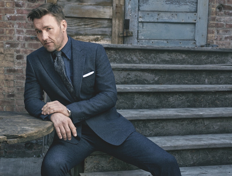
Joel Edgerton wears a navy blue virgin wool, single-breasted suit, Giorgio Armani; navy brushed cotton shirt, Drake’s; charcoal-grey silk tie, Thom Sweeney; white cotton pocket-handkerchief, Emma Willis; L.U.C 1937 classic stainless-steel timepiece, Chopard. Photograph by Gavin Bond.SaveSaveSaveSaveSaveSave