We explain the science of selecting the right combinations of colours and shades for your complexion.
Share:
Choosing which colours to wear is more than a matter of taste and aesthetic preference. No matter how much you personally like a colour, if it doesn’t suit your skintone and the shade of your hair, it’s best kept out of your wardrobe. Two key criteria come into play when figuring out the hues that most flatter a man. One is contrast, the other, colouration.
In his seminal book of men’s style guidance, Dressing the Man, sartorial swami Alan Flusser focuses on contrast. Offering advice on the manner of dress that complements each best, he defines three types:
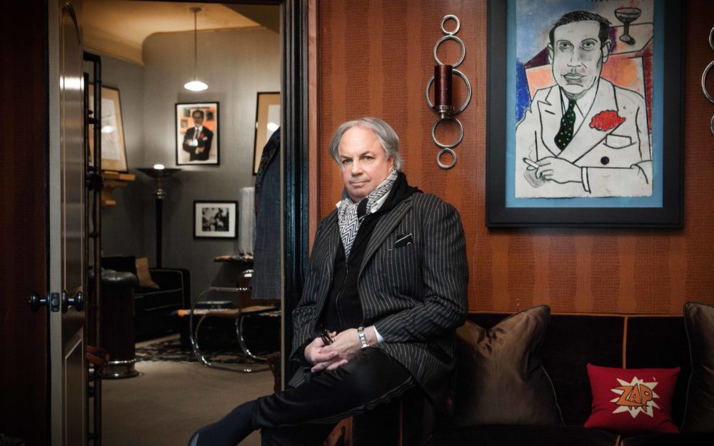
1. High Contrast: Here, there’s a dramatic difference between skin and hair colour — generally, very dark hair and light skin, as exhibited by most east Asians and many fans of Bauhaus and the Sisters of Mercy.2. Medium Contrast: People whose hair and skin have a less stark difference in darkness, for instance olive-skinned Mediterraneans with brown hair or Middle Eastern folk with black hair and a mocha skintone.3. Low Contrast: Sun-shy, august grey-haired gents. Those with mousy brown hair. Blonds or gingerish redheads, with fair or ruddy skin and light eyes, as seen in numerous Scandinavians and Scots. Black skin with dark brown hair. Alan Flusser photographed by Rose Callahan on April 10, 2018
Flusser advises echoing the degree of contrast found in your skin and hair with the clothes you wear — particularly the garments framing your face. For example, High Contrast men would do well to wear a dark suit, white or very light coloured shirt and a tie that creates a distinct contrast, whether by being very dark or bright in tone. Medium and Low Contrast chaps should work to decrease, to appropriate levels, the distinction between shades of garment — a Medium Contrast guy could wear a navy blazer and a chambray shirt, let’s say, while a Low Contrast person might select a finely patterned gingham or houndstooth shirt instead. The Medium Contrast man could wear a mid-grey suit with a lavender-and-white striped shirt and dark grey tie, the Low Contrast fella instead opting for a light pink shirt and purple tie.
Actor Dev Patel wearing Zegna Couture
Medium Contrast men are best equipped to experiment with Low and High contrast looks; it’s those on the extreme ends of the contrast spectrum who need to be a little more careful. High Contrast individuals could well appear washed-out in a tan suit with a blue shirt; Low Contrast fellows won’t be flattered by a charcoal suit and white shirt. Contrast applies regardless of personal colouration — however there are matters of hue you should be conscious of, depending on your hair and skin tone.
Grey is the ‘Goldilocks’ colour that works for pretty much everyone, from fair-skinned to ebony. The rule of thumb is the darker your skin, the lighter the grey should be, and vice versa. Navy blue is another crowd-pleaser, best suited to those with pale and medium skin tones, while lighter blues flatter the olive and dark complexioned (though they can also look great on redheads). Burgundy and terracotta red, tan, cream or white favour the swarthier gentleman — if you’re not readily mistaken for a local when travelling in Mexico, southern Italy or Spain, please refrain.
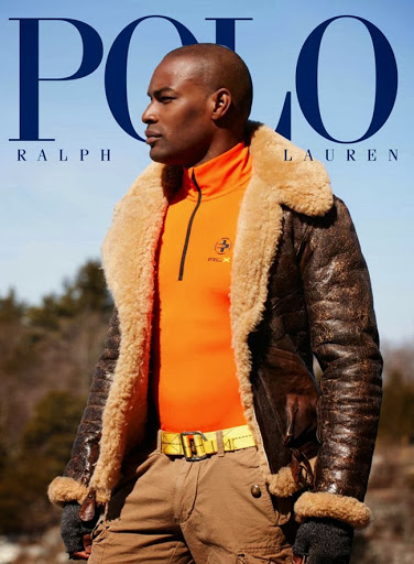
Brown looks sweet as chocolate on fair to medium skin. Green’s incredible on redheads (though moderation is recommended, lest you resemble a fightin’ Irish leprechaun) and emerald’s brilliant on most blonds. A stark black and white combo isn’t ideal on the paleface, we’re terribly sorry to inform any pasty gingers or blonds hoping to pursue a career in the service industry or an orchestra. Primary colours work a treat on medium and dark skin tones (think: Tyson Beckford in those classic Polo Sport campaigns). The richer and deeper your colouring, the more leeway to play with pastels and bright white, the less to mess with earth tones. No matter your race, complexion or creed, universally pleasant hues include mellow dusky rose, true red, teal, and deep purple — especially apt if you’re having a smoke on the water.
All this wisdom notwithstanding, concerns of contrast and colour are trumped by issues of propriety. In his philosophical dialogue, The Book of the Courtier (famed as the wellspring of ‘sprezzatura’ in the contemporary menswear conversation), Baldassare Castiglione suggested that the proper gent should wear subdued rather than garish colours, qualifying the statement by saying one must take care to observe the prevalent customs of their social surroundings. Quite right. So when the occasion calls for black and white formalwear, tux up — complexion be damned, man.

 Brown looks sweet as chocolate on fair to medium skin. Green’s incredible on redheads (though moderation is recommended, lest you resemble a fightin’ Irish leprechaun) and emerald’s brilliant on most blonds. A stark black and white combo isn’t ideal on the paleface, we’re terribly sorry to inform any pasty gingers or blonds hoping to pursue a career in the service industry or an orchestra. Primary colours work a treat on medium and dark skin tones (think: Tyson Beckford in those classic Polo Sport campaigns). The richer and deeper your colouring, the more leeway to play with pastels and bright white, the less to mess with earth tones. No matter your race, complexion or creed, universally pleasant hues include mellow dusky rose, true red, teal, and deep purple — especially apt if you’re having a smoke on the water.
All this wisdom notwithstanding, concerns of contrast and colour are trumped by issues of propriety. In his philosophical dialogue, The Book of the Courtier (famed as the wellspring of ‘sprezzatura’ in the contemporary menswear conversation), Baldassare Castiglione suggested that the proper gent should wear subdued rather than garish colours, qualifying the statement by saying one must take care to observe the prevalent customs of their social surroundings. Quite right. So when the occasion calls for black and white formalwear, tux up — complexion be damned, man.
Brown looks sweet as chocolate on fair to medium skin. Green’s incredible on redheads (though moderation is recommended, lest you resemble a fightin’ Irish leprechaun) and emerald’s brilliant on most blonds. A stark black and white combo isn’t ideal on the paleface, we’re terribly sorry to inform any pasty gingers or blonds hoping to pursue a career in the service industry or an orchestra. Primary colours work a treat on medium and dark skin tones (think: Tyson Beckford in those classic Polo Sport campaigns). The richer and deeper your colouring, the more leeway to play with pastels and bright white, the less to mess with earth tones. No matter your race, complexion or creed, universally pleasant hues include mellow dusky rose, true red, teal, and deep purple — especially apt if you’re having a smoke on the water.
All this wisdom notwithstanding, concerns of contrast and colour are trumped by issues of propriety. In his philosophical dialogue, The Book of the Courtier (famed as the wellspring of ‘sprezzatura’ in the contemporary menswear conversation), Baldassare Castiglione suggested that the proper gent should wear subdued rather than garish colours, qualifying the statement by saying one must take care to observe the prevalent customs of their social surroundings. Quite right. So when the occasion calls for black and white formalwear, tux up — complexion be damned, man.
 Actor Dev Patel wearing Zegna Couture
