Ross Povey delves into the history of the Rolex Explorer II.
Share:
We often hear the term ‘tool watch’ or ‘professional watch’ used about some of the most iconic and desirable watches. Dive watches were originally developed for divers to time descent and ascent periods via the rotating bezel which indicated elapsed time. To be clear, in the 1960s and 1970s these watches weren’t just cool accessories that looked good, they were vital safety tools that saved lives. The GMT complication was developed for professional use by pilots and travellers, through necessity due to the advent of commercial air travel, to allow them to monitor two time zones. The chronograph had a number of different timing scales that aided racing car drivers, military leaders and doctors in their professional duties. The Submariner, GMT Master and Daytona therefore have some deep roots as tool watches. Today I’m going to lift the lid on one of the quiet stars of the Rolex tool watch line.
Going Underground
Like other more esoteric members of the Rolex sports line, the Milgauss and the Turn-O-Graph for example, the Explorer II received a muted reception when launched in 1971. To many, the watch was garish and the dial too busy and so it was slow to sell. It has, however, become a very desirable watch in today’s market and whilst it’s not necessarily rare (a term that is used far too readily in the current vintage market) it’s not as easy to find in outstanding condition as say a Submariner or GMT Master. One of the reasons it was slow to sell was the fact that it had a 24-hour hand and a 24-hour bezel…but the bezel was fixed and so it wasn’t technically a GMT function, as one couldn’t monitor two time zones. But it was a tool watch and to understand the watch we need to go deep; deep underground and into the earth’s hidden crevices, like true speleologists…
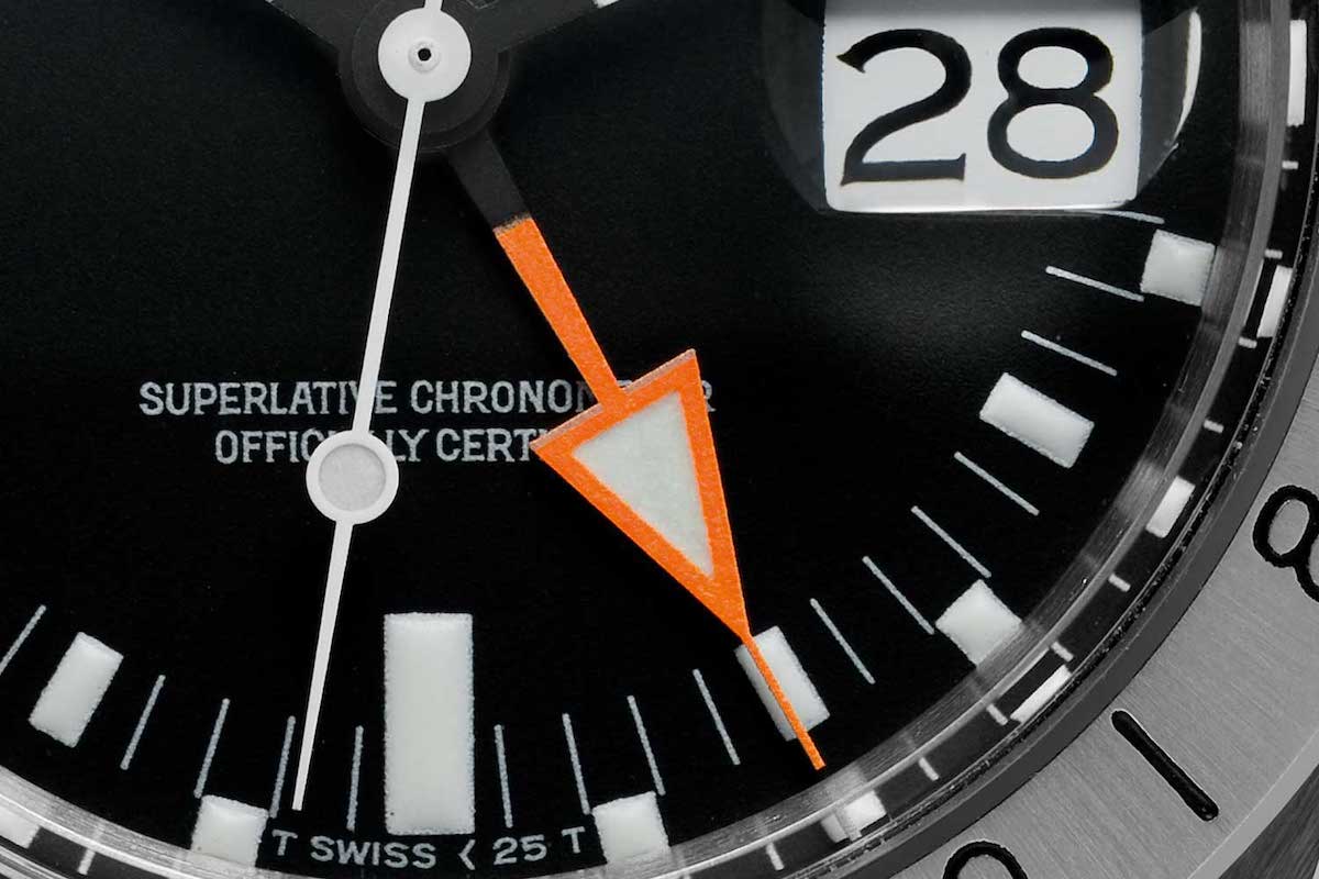
Designed for speleologists and potholers, the Explorer II helped speleologists to keep a track of time via the large luminous 24-hour hand
Speleology is the study of caves and it has been, since the late nineteenth century, its own specific science that is quite distinct from geography and geology. The leisure pursuit of exploring caves is called potholing or caving, but is occasionally called speleology as a lot of the actual exploration and research of cave structures has been done by potholers as part of their hobby. Not for the faint hearted, these cavers have to get themselves through some very small spaces and can spend prolonged periods of time within the cave networks. This can become acutely disorientating, especially when one loses track of time.
Step forward the Explorer II and its 24-hour hand and fixed bezel. Designed for speleologists and potholers, the watch afforded such explorers to keep a track of time and whether it was am or pm via the large luminous 24-hour hand. A specialist application for sure, but also useful for those who spent large amounts of time away from natural daylight. It would also be useful for explorers in continents where there were periods of constant daylight or darkness.
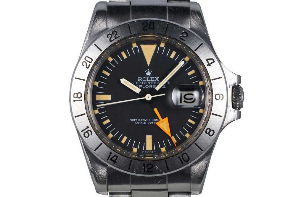
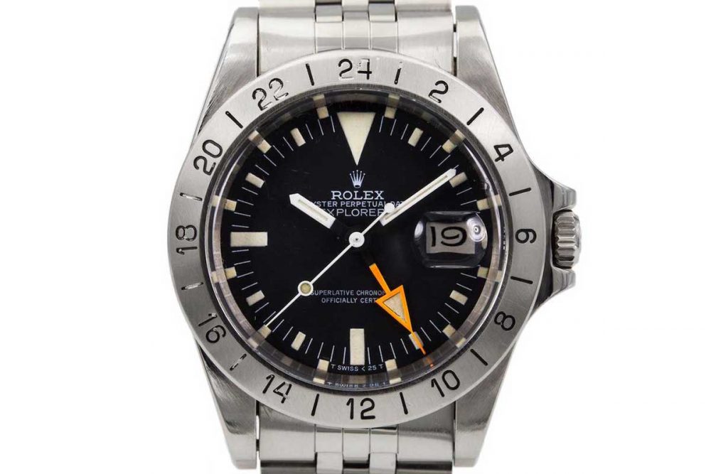
The Explorer II ref 1655 (Image: Bob’s Watches) The 16550 is probably the most important Explorer II in that this was the watch that ushered in everything that we now associate with this model.
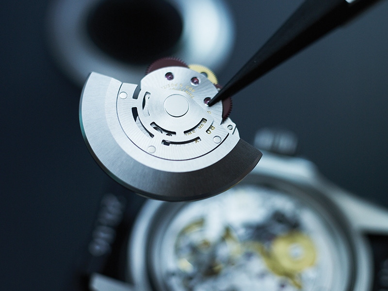
The 1655 was powered by the 26 jewel caliber 1575 GMT, the same movement as in the 1675 GMT Master. A modified base caliber 1570 movement, the caliber 1575 had a date feature and logically the caliber 1575 GMT had the additional 24-hour hand. The movement was automatic, had the hacking-seconds feature (where the seconds hand stopped when the winding crown was fully pulled out to adjust the time) and boasted a 48-hour power reserve. This chronometer rated movement was housed in a 39mm stainless steel case with crown guards and the watch had a fixed, non-rotating, bezel with 24-hour markings; even numbers in arabic numerals and odd numbers represented with hash markers.
The McQueen Big Arrow
The vintage Rolex collecting community loves nothing more than giving a watch a nickname or a namesake. The Paul Newman Daytona is the most obvious example of a namesake at the moment. Arguably, the art of watch collecting was spearheaded by the Italians and we have a lot of Italian parlance in our everyday vintage watch language. Ovettone (big egg) for the big 1950s bubbleback watches, Padellone (large frying pan) for the large reference 8171 moon phase watch and stelline (little star) for watches with the small stars as hour markers. Interestingly, the 1655 Explorer II has two nicknames – freccione (big arrow) and Steve Mcqueen. The first is derived from the large and boldly coloured 24-hour hand and the second due to the fact that apparently the famous actor often chose to wear one. In fact it was a matte dialed Rolex Submariner reference 5512 that he most famously wore, but the name has stuck for the 1655. The recent Phillips watch gifted by McQueen to his stunt man has also added considerable weight to the 5512 being associated with McQueen and so I more naturally err towards preferring the Freccione monicker for this watch.
The devil is in the details and in this case the details are in the dials, the bezels and seconds hands. But let's start with the dials. There were actually seven dials produced during the lifespan of the 1655 - five by Stern and two service replacement dials manufactured by Beyeler. The two service dials were available later then the watches production run and were stockpiled to service the watches for the following decades. It’s important to remember that Rolex were not always the fully in-house manufacture that they are today and that production of components was outsourced to other companies. Therefore, we see variations in the batches of dials and bezels that were supplied.
On Your Marks
I don’t really intend to focus on the service dials but more on the main production run. They are referred to as the Marks (MK) one to five (1-5). The dials had a large triangle at 12 o’clock and rectangular hour markers at six and nine o’clock. The remaining hour markers sit within the minute track and are essentially extra-bold minute markers. Where the dial gets a little busier is on the outer edge of the dial where intermittent 24-hour markers sit, which are off set from the regular hour markers. It’s a very distinctive look and led some collectors to refer to the dial as the Disco Dial, due to its resemblance to a 1970s disco floor with flashing square light panels. The different marks are distinguished by the printed text on the files.
MK1 (Image: Oysterpalace.com)
The MK1: The first iteration had a wide coronet, with a rounded foot on the R of Rolex. The bottom of the dial was marked T SWISS T.
The MK2: The second series dial is very similar to the MK1. The coronet is a little more splayed with heavier dots on the tips of the coronet and has been given the name Frog Foot by collectors (it can also be seen on Rolex Explorers reference 1016). The other big difference is the spacing of the word PERPETUAL. It is less wide than the MK1 and the top of the letter L lines up with the bottom right stroke of the letter X in ROLEX (on the MK1 the A of PERPETUAL sits below the X). The MK2 also has T SWISS T on the bottom edge denoting the use of tritium on the dial.
MK2 (Image: Bob’s Watches)
The MK3: This version is noticeably different due to what collectors term the Rail Dial. The coronet is different to the MK2, in that it is wide, better defined and symmetrical. It is still marked T SWISS T on the outer bottom edge. The SUPERLATIVE CHRONOMETER OFFICIALLY CERTIFIED text in the bottom half of the dial is the clue to the MK3. The letters C in the words CHRONOMETER and CERTIFIED are aligned vertically, which creates a noticeable vertical gap in the two lines of text. This is known as a Rail Dial and can also be seen on some reference 1665 Sea-Dweller.
MK3 (Image: Rolex Passion Market)
The MK4: The coronet on the MK4 is a noticeable difference, being narrower and seemingly taller. Interestingly, the text alignment of the letter L in the word PERPETUAL is the same as the MK2. The most noticeable feature is the change at the bottom edge of the dial which reads T SWISS < 25 T in a serif font. This signified that the tritium used for the painting of hour markers was emitting less than 25mCi.
MK4 (image: Craftandtailored.com)
The MK5: The last of the production dials for the 1655, the MK5 had the T SWISS < 25 T at the bottom edge of the dial but without serifs on the font. Also, the coronet is more narrow with a bigger opening in the oval at the bottom of said coronet (which was reminiscent of the coronets on the Maxi dial Submariners reference 5513).
MK5 (Image: HQ Milton)
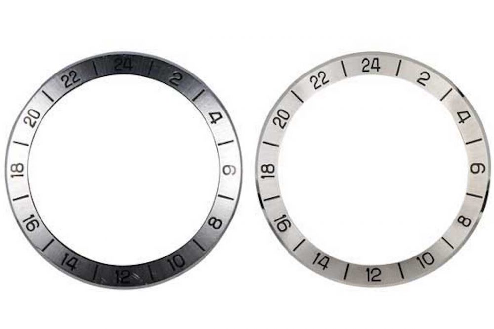
As I mentioned earlier, there were also differences in the bezels over the production run. There were four production versions and a service version also exists. The breakdown of the bezels is as follows:
The MK1: A thick font with the edges of the numerals sitting very close to the inner edge of the steel bezel. These were used on watches fitted with MK1 and MK2 dials.
The MK2: A thick font where the numerals are centred. Seen on some MK1 dial watches but mostly on watches with MK3 and MK4 watches.
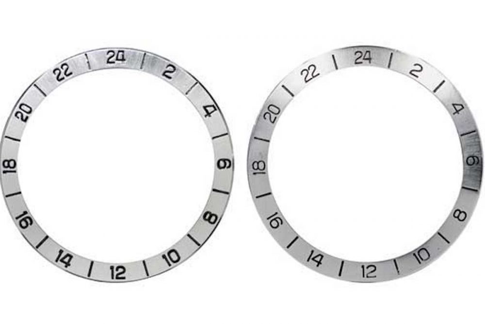
=The MK3: The fonts on the MK3 are thin and centrally positioned on the bezel. These were fitted on some watches with MK3 dials but mainly used on MK4 dialled watches.
The MK4: Found on watches with MK5 dials, the MK4 bezel has numerals with a thin font, but there are some noticeable changes to the font. The most noticeable difference is the ‘long hook’ on the 1s.
(From left) Differences of bezels for MK1 and MK2 (From left) Differences of bezels for MK3 and MK4 Bezel for MK5
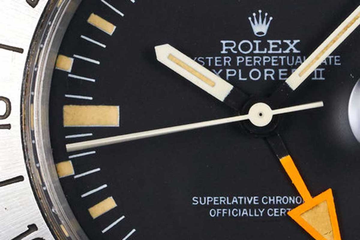
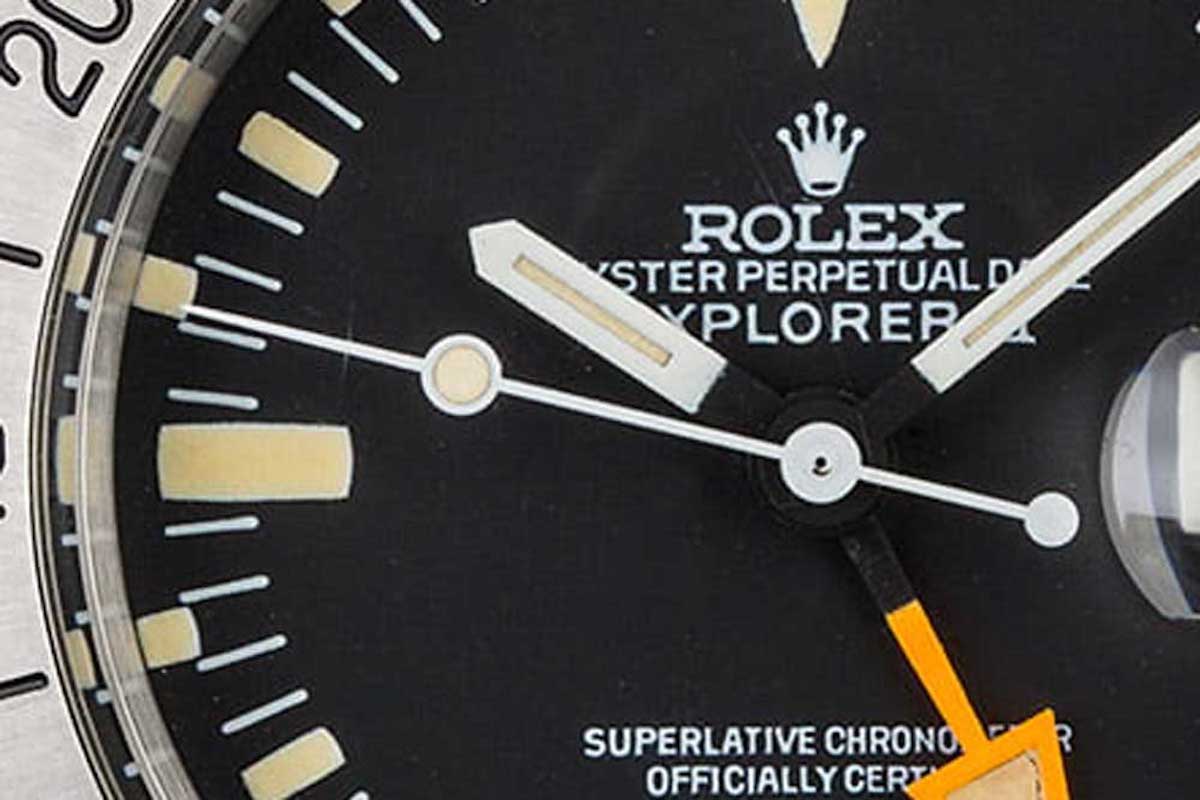
The final point to note about the 1655 is the seconds hand. Early versions of the reference, from the first year of production, were fitted with a straight seconds hand. The hands were painted white and were of a fairly minimalist design. The so-called straight seconds hand was a simple long, thin needle-esque centre sweep hand. Rolex introduced a seconds hand with a lollipop, luminous filled bubble quite quickly within the watch’s lifespan. Collectors look for watches with a MK1 dial, MK1 bezel and straight seconds hand when wanting the perfect early Explorer II.
So there we have it, the potted history (or should that be potholed history?) of a very cool watch with a very cool professional history. I just wish that in line with their aquatic-themed watch the Seadweller, Rolex had called it the Cave Dweller. Now that would have been cool!


 Speleology is the study of caves and it has been, since the late nineteenth century, its own specific science that is quite distinct from geography and geology. The leisure pursuit of exploring caves is called potholing or caving, but is occasionally called speleology as a lot of the actual exploration and research of cave structures has been done by potholers as part of their hobby. Not for the faint hearted, these cavers have to get themselves through some very small spaces and can spend prolonged periods of time within the cave networks. This can become acutely disorientating, especially when one loses track of time.
Step forward the Explorer II and its 24-hour hand and fixed bezel. Designed for speleologists and potholers, the watch afforded such explorers to keep a track of time and whether it was am or pm via the large luminous 24-hour hand. A specialist application for sure, but also useful for those who spent large amounts of time away from natural daylight. It would also be useful for explorers in continents where there were periods of constant daylight or darkness.
Speleology is the study of caves and it has been, since the late nineteenth century, its own specific science that is quite distinct from geography and geology. The leisure pursuit of exploring caves is called potholing or caving, but is occasionally called speleology as a lot of the actual exploration and research of cave structures has been done by potholers as part of their hobby. Not for the faint hearted, these cavers have to get themselves through some very small spaces and can spend prolonged periods of time within the cave networks. This can become acutely disorientating, especially when one loses track of time.
Step forward the Explorer II and its 24-hour hand and fixed bezel. Designed for speleologists and potholers, the watch afforded such explorers to keep a track of time and whether it was am or pm via the large luminous 24-hour hand. A specialist application for sure, but also useful for those who spent large amounts of time away from natural daylight. It would also be useful for explorers in continents where there were periods of constant daylight or darkness.